


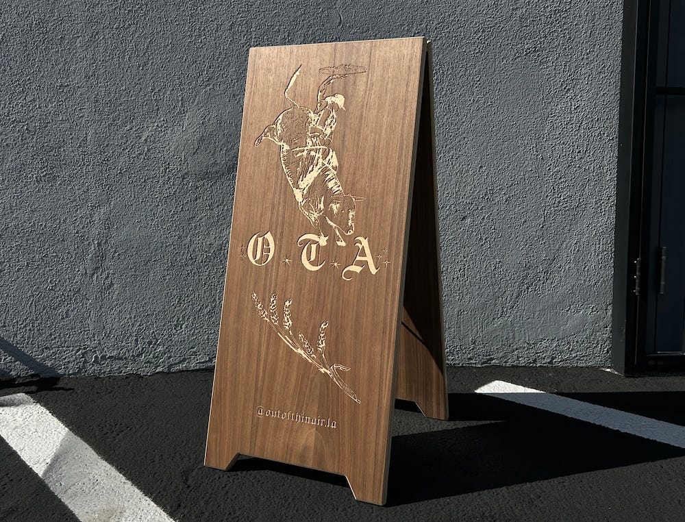
These days, restaurants and cafes are trying to get your buy-in before you even step foot inside. Everything from vintage-looking signage (see: Donna’s, Vandell, and Hermon’s) to a chic A-frame on the sidewalk has the power to attract new customers, sometimes before a business has even launched. And, ideally, the silent signaling that happens between restaurant and guest can inspire that person to spend, if the look is just right. In 2026, an unopened restaurant can post a cool-looking Instagram logo as their profile picture and quickly gain 5000 followers. When Wilde’s opened in Los Feliz last fall, they didn’t hire PR—but there was a line down the block on day one. Did the of-the-moment branding both on Instagram and their front door play a role in their overnight success? I’m going to go with…probably.
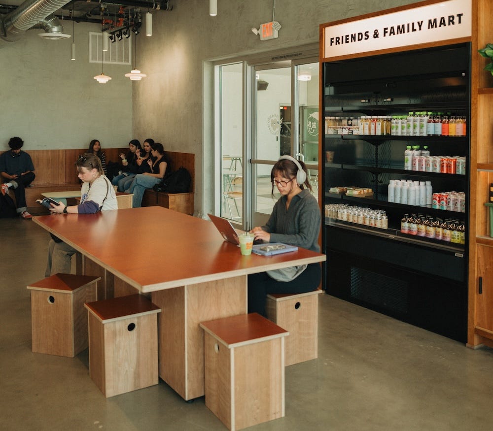
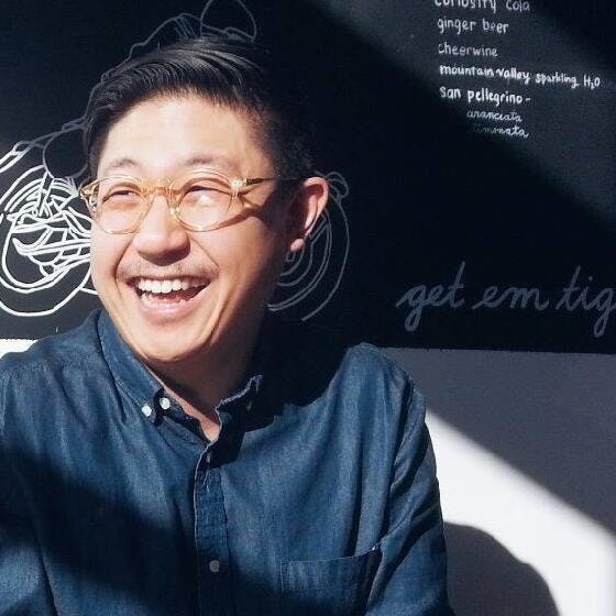
One of the designers behind some of L.A.’s most influential restaurant branding is Thomas Kong of Kongruent Works, whose company designs everything from logos to A-frames to actual furniture. He’s worked with hot spots like the brand-new Mokja, Bodega Park, Out of Thin Air, and pop-up ice cream brand Servet, among many others. A Valley native, Kong fell in love with cafe culture while in design school during a stint at Cafe Dulce which led him to found House Roots Coffee in his hometown of Granada Hills with partner Jimmy Lee. His niche is helping other Korean American business owners with affordable design for their mom-and-pop shops. But in the process, he’s inspiring other cafes with his trendsetting, minimalist design aesthetic. We called up Kong to talk about all things design, why you’re seeing more A-frames all over L.A., and what elements go into creating a viral restaurant brand.
You offer everything from branding to millwork. But there’s more, right?
Thomas Kong: It’s a little bit of a hodgepodge, but we started back in 2015. I’m a partner at House Roots Coffee, and when we were opening our first cafe, we were looking for the services I provide now: branding, menus, signage, interiors. As a small mom-and-pop cafe, your options are limited if you don’t have a ton of capital. You can go to the big firms if you have money, but for things like menus and signage, you’re often limited to: ‘Can I get lucky on Etsy?’
So it started from our own needs, and then it started snowballing. We wanted to be a one-stop shop for small cafes, from branding and graphic design to signage and interiors. These days, we focus a little more on signage, branding and millwork. We do a lot of furniture and build-outs, which still coincides with signage.
How can design help communicate what a restaurant is actually about before anyone has even stepped foot inside?
I think that’s the problem a lot of small business owners are trying to solve. Especially in L.A. where cafes are popping up every single day, there are fewer barriers to opening something because the knowledge is more readily accessible than ever. Between YouTube, Instagram, and ChatGPT, people can become a professional overnight.
Because the barriers to opening your own restaurant or cafe are lower than ever, the thing that can really set people apart now is the brand. There’s only so many black sesame lattes and matcha clouds that will lure someone in. There’s amazing pizza restaurants in L.A., but if you’re a person with some time and money, you can get a Gozney and make some pizza. That kind of thing.
I think small business owners are leaning into what Apple did in the early 2000s: making it more about a lifestyle than simply a product alone. So the question became: ‘Can people latch onto the lifestyle and aesthetic we’re trying to sell them?’ And then the food backs it up. In the early 2000s, everything was novelty. Now it’s: ‘Can the brand resonate with someone on an emotional level?’
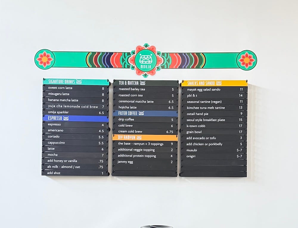
Tell me about some recent design projects. I know you did the slat-style menu on the wall at Mokja.
Mokja was fun. I’ve been working with Frank La from Be Bright Coffee for over a decade, so when he partnered with chef Debbie Lee, he brought me in to help with some of the aesthetics and menus.
We’ve also worked with Northern Cafe and Nook in Costa Mesa/Torrance. Nook has a few cafes, and their queues can be up to 40-50 people long throughout an average day. One of the things they were trying to solve was that people waiting in line outside weren’t looking at the menu in advance. By the time they got to the register, they were taking another two to five minutes to make a decision.
So we designed this five-foot A-frame sign with a QR code on it. The idea is, 20 minutes before you get to the front of the line, you scan the QR code, check out the menu and make a decision. By the time you get to the register, you’re ready to go.
It’s not just about design, but we’re now tapping into an operational need. Design is actually helping fulfill a gap in operations, which makes their ticket times faster. They can move more product at a faster rate. We’re presented with these interesting design-operational challenges from time to time, which is fun.
“The thing that can really set a business apart now is the brand. There’s only so many black sesame lattes and matcha clouds that will lure someone in.”
A-frames are huge right now, and I know they’re often inspired by Korean cafe culture and design in places like Seoul. What inspires you when designing one?
A lot of the A-frame and signage inspiration is pulled from highly dense metropolitan areas like Seoul and New York. The A-frame really serves one purpose: It’s a disruptor. It literally stands in your way so you can’t ignore it.
In Seoul and New York, where there’s a bodega or cafe every five feet, you need to grab someone’s attention and say: ‘This is who we are. We’re tucked in between these two stores, and you need to pay attention to us.’
In 2015, if you’d asked me about clients coming to us for A-frames, it was 100 percent an aesthetic decision. These days, it’s solving a real need. We hear things like: ‘People keep walking by our cafe because they don’t see our sign.’
In Los Angeles, the A-frame trend is finally catching up to what has been happening elsewhere.
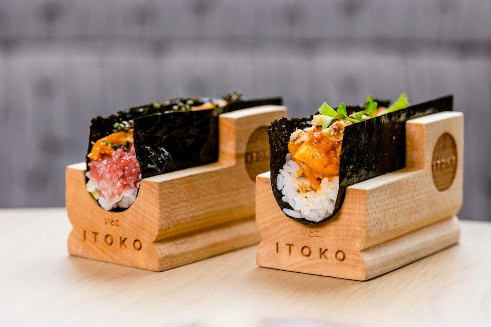
Overall, how would you describe your design aesthetic?
As played out as it is, I really love that Scandinavian-Japanese kind of aesthetic. Maru set the precedent for that look in L.A., and then every cafe started following suit.
But I think the reason why it’s so popular is that light-toned wood, Japan-y-Scandi kind of aesthetic brings a sense of peace and calm. I also love Loquat, where they use stainless steel and walnut, which is getting more popular because people are tired of the light-wood aesthetic. But when you walk into a cafe like Bodega Park or Maru, you instantly feel like, ‘I like being in here.’
In terms of design philosophy, at the end of the day, we do work with a lot of wood and steel. If I can narrow it down, it’s honesty in materials. If it’s walnut, show off the walnut. If it’s Baltic birch, show off the Baltic birch.
I think in the restaurant and cafe industry, the reason why wood and metal resonate with customers is because they reflect the ethos of restaurant. Natural materials say: ‘We’re quality-driven. We care. We’re making our aiolis or whatever from scratch.’ Those materials reflect that craft.
“The A-frame really serves one purpose: It’s a disruptor. It literally stands in your way so you can’t ignore it.”
If you were a new cafe owner who wanted to make a big impact without a ton of money, where would you spend?
Branding is very important. We’re not in an era where you can haphazardly create an identity and present it to the world. The branding and the physical touch points that reflect it are very important.
I would say put your best foot forward with the branding, an A-frame, some signage, maybe some packaging that translates your brand like tissue paper. Then, as you become more profitable, you can remodel the space. That’s happened a lot with our clients. They’ll operate for two or five years and then do an overhaul.
How do you feel about restaurant merch? It’s feeling like the new streetwear these days.
We don’t produce T-shirts; but we do design them. But you’re 100 percent correct—cafe and restaurant merch has become like Nike drops or something.
People who resonate with the brand and have become loyal customers are thinking, ‘I want to continue to support you,’ but also, ‘I want to be seen as someone who subscribes to this brand that I really love.’
When I was in college, it was all about band T-shirts. Now it’s all about restaurants. Food is no longer just food. It’s an extension of a person’s identity, and people want to showcase that identity in their everyday lives. Practically speaking, merch is also great because it doesn’t expire or go bad. It’s a smart move to make extra revenue for mom-and-pop shops.
What are you working on next?
We’re working on Stumpy Burger & Coffee in Granada Hills. They took over a historic 1950s-era Fosters Freeze location and are converting it to burgers and coffee. They’re leaning into an Americana diner aesthetic.
The owner is Korean American, but he loves classic Americana diners—places like Max and Helen’s, the old Canter’s space. So they’re tying those nostalgic diner touch points into something a little more modern: smashburgers and coffee.
The space looks elevated, but you can still get a $5.99 double smashburger. It’s this interesting clashing of two worlds where you come into the space and feel like there’s a lot of intention behind it, but you’re not going to leave having spent $200.
They even have a drive-thru, which is so fun because 99% of the time, drive-thrus are owned by mega corporations. For a mom-and-pop to take over an old drive-thru and give it their own expression with high-quality coffee, tallow fries and burgers is really intriguing to me. It’s taking something that has this stigma to it and trying to bring their own flavor to it.
Follow Kongruent Works on Instagram!

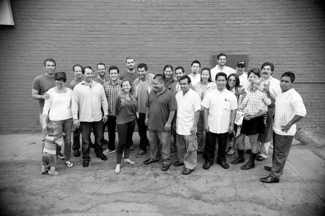
-Rustic Canyon is celebrating its 20-year anniversary on December 7th by debuting a dinner series called “The First 20” featuring some of its most notable alumni and friends. Kicking off on October 6th and continuing every Tuesday of that month, the four-week series will feature special menus from alums and friends like Evan Funke, chef Saw Naing (The Dutchess), and Kato’s Erika Chan. 1119 Wilshire Blvd., Reservations.
-Speaking of Santa Monica restaurants, the forthcoming Bar Fortuna from Crudo e Nudo’s Brian Bornemann (as mentioned in our fall preview) is finally opening in late October. On the Italian-inspired menu, look out for pasta dishes like the “Clam Show” bucatini and spaghetti alla puttanesca, plus shaved veggie salads and several Negroni variations. In the mornings, you can grab espresso through a window or pick up fresh pasta by-the-pound from chef de cuisine Jose Morales. 2917 Main St.,
-Opening just a few weeks prior, Nancy Silverton’s Spacca Tutto, inside the newly resurrected Palisades Village which is something of a belated sibling to her beloved Hancock Park steakhouse, Chi Spacca. From their Instagram: “Inspired by the traditional American steakhouse, we put a lot of thought into the sourcing of the different cuts and breeds of beef with classic steak sauces and butters. But there really is something for everyone. The menu is designed with the intention of our neighbors coming in multiple times a week and getting something different each time.” 15225 Palisades Village Ln.,
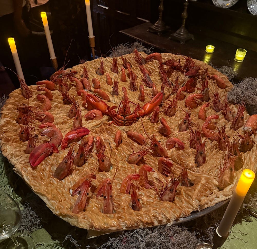
-And finally, I stopped by Eater’s Off Menu party last Saturday night at Tam O’Shanter and it was a truly delightful event! I chatted briefly with Eater Brand Director Lesley Suter who told me that “they had so much fun throwing the 20-year anniversary party last year in NYC, they just wanted to do it again!” as the inspiration behind the fiesta. Each room of the cavernous Atwater restaurant was filled with different delicious surprises, including a massive S-shaped sheet cake from Quarter Sheets’ Hannah Ziskin, and a spectacle-sized stargazy pie from NYC British-inspired hot spot Dean’s with plenty of prawn heads poking out. I also tried ceviche from Holbox, pancakes from Cafe Telegrama, and Peking duck from SGV’s legendary Ji Rong. 10/10 would recommend on all fronts.
Loved this interview and will be reaching out!